
Adelle. Superfamily. Veronika Burian & José Scaglione, 2009. Typetogether. Mechanistic (Slab Serif). Sans, & Condensed Variants.
Adelle. Superfamily. Veronika Burian & José Scaglione, 2009. Typetogether. Mechanistic (Slab Serif). Sans, & Condensed Variants.

DSType Acta. Acta Type System. Dino dos Santos, 2011. DSType. Transitional Serif. Acta Type System Variants: Acta, Acta Deck, Acta Headline; Acta Display; Acta Symbols; Acta Poster.

HTF Acropolis. Proteus Project Superfamily. Jonathan Hoefler, 1993. Hoefler Type Foundry. Mechanistic (Slab Serif) (Grecian / Chamfered). The Proteus Project: Ziggurat, Leviathan, Saracen, and Acropolis variants.
FF Absara. Superfamily. Xavier Dupré, 2004. Fontshop. Contemporary Slab Serif & Humanist Sans. Headline (Display) variant.
A*I Prospera II. Peter Fraterdeus, 1987–91. Alphabet. Transitional.
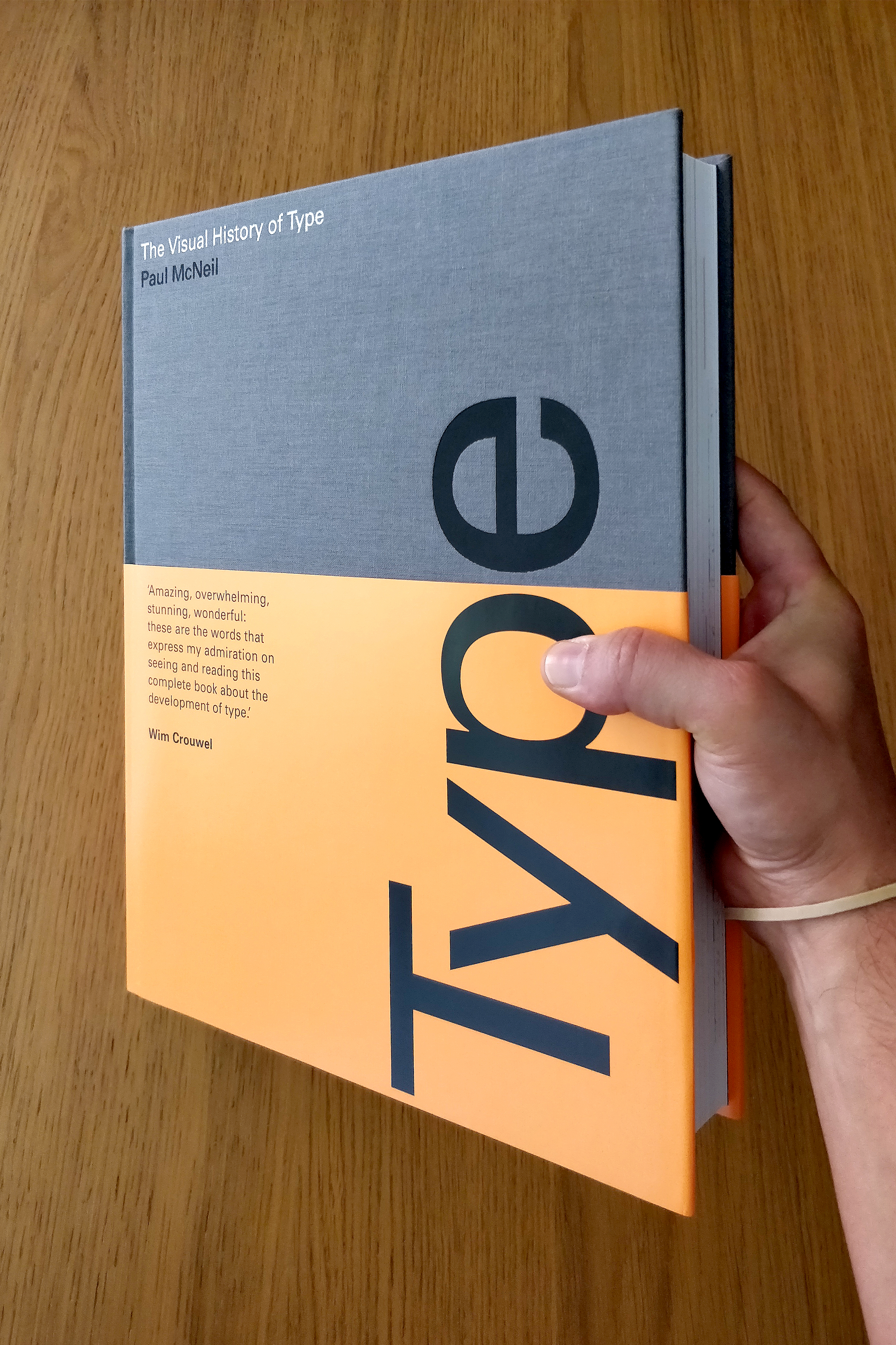
Yesterday I’ve received my personal pre-order copy of Paul McNeil’s “The Visual History of Type”. A massive 600+ pages tome that looks and feels quite heavy (although the paper stock is pretty light).
The book is a kind of “love-at-first-sight”: from the gray cloth binding and fluorescent orange wrapper on the cover; to the choice of typesetting it all in Univers. It’s hard not to drool over this beautiful and very readable book, with “ginormous” reproductions of more than 300 typefaces [specimens], ranging from 1450 to 2015… I cannot recommend this book enough… For all typophiles and design students. It’s a must.
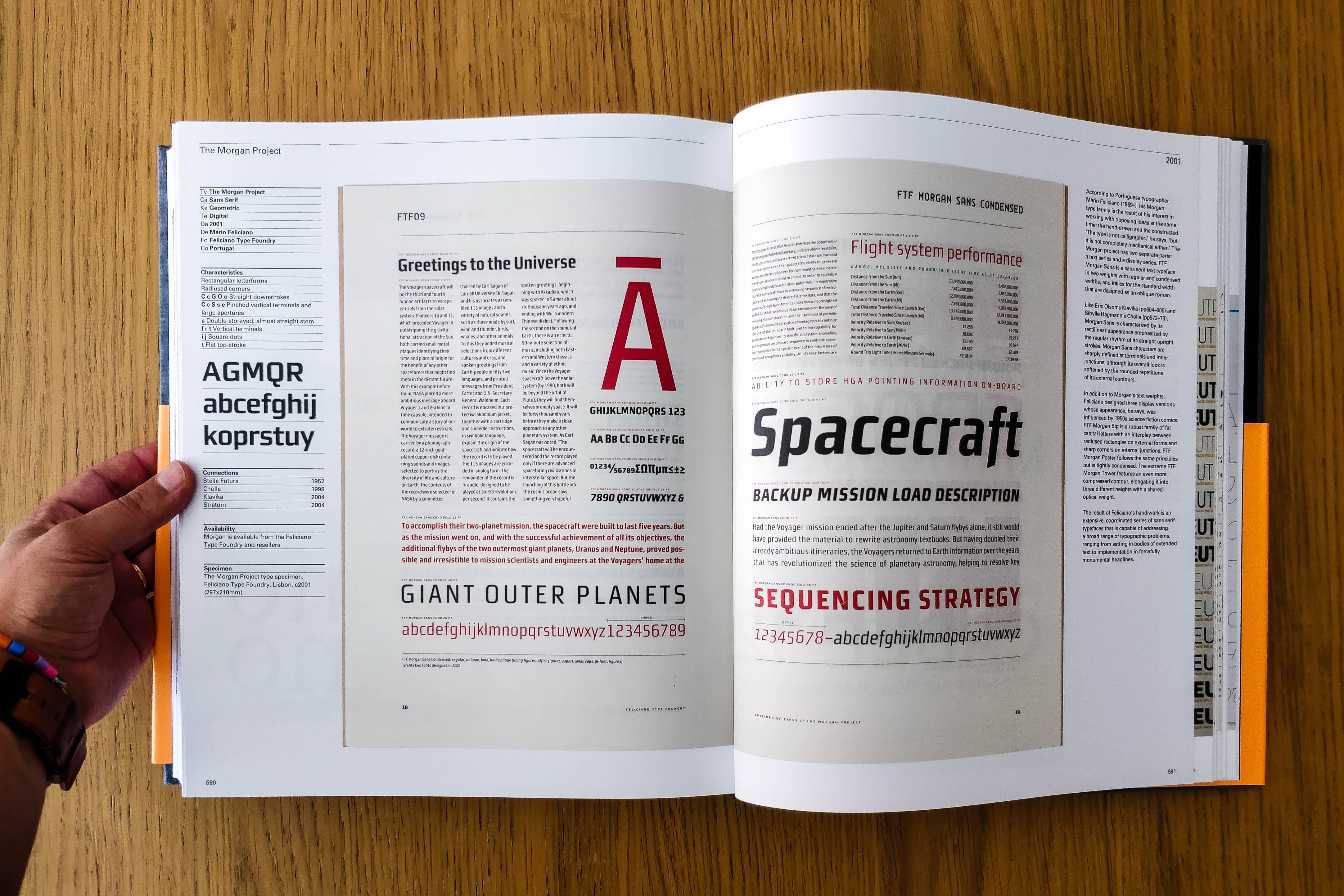
One of my surprises today was that, when browsing the last pages, Mario Feliciano’s Morgan is featured right alongside other personal favourites of mine, such as Underware’s Dolly, Bil’ak’s Fedra, House’s Neutraface… you name it.
I am only sorry McNeil hasn’t included recent Portuguese faces such as Dino dos Santos’ Prelo (or Leitura…), Ricardo Santos’s Lisboa, Rui Abreu’s Usual, Joana Correia’s Artigo, or Natanael Gama’s Exxo… there are so many that would fit his criteria. But I am happy that McNeil featured at least one of our professional type designers.
The Visual History of Type is a comprehensive, detailed survey of the major typefaces produced since the advent of printing with movable type in the mid-fifteenth century to the present day. Arranged chronologically to provide context, more than 320 typefaces are displayed in the form of their original type specimens or earliest printing. Each entry is supported by a brief history and description of key characteristics of the typeface. This book will be the definitive publication in its field, appealing to graphic designers, educators, historians and design students. It will also be a significant resource for professional type designers and students of type.
The medium is the message; the typeface is the message.
Cees W. de Jong, in (the Preface) Type Specimens. A Book about Diverse Letters and Ornaments with Examples of Artistic Printing.
de Jong, C. W., Purvis, A. W., & Tholenaar, J. (2009). Type: A Visual History of Typefaces and Graphic Styles, Vol. 1. Koln: Taschen.

Muriza: http://www.muriza.com/ A nice slab typeface from type-me! Via Type for You.

This Week in Type. A handfull of links, every-other week or so… In this edition:
Lately, we’ve seen the rise of short very well-made “DSLR-type” documentaries. This one, from The Times, is a beatifull example of a well edited short story in the form of a web documentary. Simple. Beatiful. Clear. worth subscribing to the Unquiet Youtube’s Channel.
The Times’ Unquiet Film Series
Via: Fontfeed & FastCo Design
Adobe Source Sans, even lacking variable width alternatives, has been a favorite of mine for the past couple of years. This week I found out that there’s a Serif version in the making: http://store1.adobe.com/cfusion/store/html/index.cfm?store=OLS-US&event=displayFontPackage&code=1966
Source Serif Pro is a serif typeface in the transitional style, designed to complement Source Sans. Their close companionship is achieved by a careful match of letter proportions and typographic color. While designed to harmonize with its serif-less counterpart, Source Serif often takes its own direction, in part because the two are inspired by different historical precedents. Source Serif is loosely based on the work of Pierre Simon Fournier, and many idiosyncrasies typical to Fournier’s designs (like the bottom serif on the b or the middle serif on the w) are also found in Source Serif. Without being a pure historical revival, Source Serif takes cues from the Fournier model and reworks it for a modern age.
Get it (preferably) on GitHub: https://github.com/adobe/source-serif-pro. It’s being designed/coordinated by Frank Grießhammer
Type Sample: http://www.typesample.com/
A nice plugin/bookmarklet to identify and sample webfonts with pretty nifty liking integration/collection to the original website. Similar to Fonts in Use in its purpose. I only with they could merge the two initiatives.
Fábio Duarte Martins has been regularly publishing a very interesting set of articles about Typeface Design and Lettering. This one is no exception. The Art of Eyeballing: http://learn.scannerlicker.net/2014/06/03/the-art-of-eyeballing-part-one-introduction/
Nice short and relevant title, by the way. Better only with irony, such as “the science of eyeballing”… ;)
Tik & Tok: http://ticktock.fontbureau.com/
A nice friendly stencil typeface from Cyrus Highsmith
Fine traditional letterpress printing and hand bookbinding.
Benlev Marketing digital, lançamento, monetização, vendas, ibfoprodutos, treinamentos,
Private Press of Pedro, Marta & Sons
Procura do domínio da tridimensionalidade através da ferramenta Blender 2.77.
Histórias músicas e memórias da Vovó Tininha
All things type, from the Portuguese community
where youth has nothing to do with age
Thoughts & Visuals about Type & Graphic Design
Open Source Type Design
Announcements of calls for papers for design-oriented journals and conferences
Um blogue do Ressabiator
Se não podes pô-los a pensar uma vez, podes pô-los a pensar duas vezes

